This beautiful riverside parkland area in Fairfield needed some location branding. It’s a popular spot for many families to picnic, walk and cycle along the river, enjoying the natural beauty of the water and parkland which winds towards south-west Brisbane.
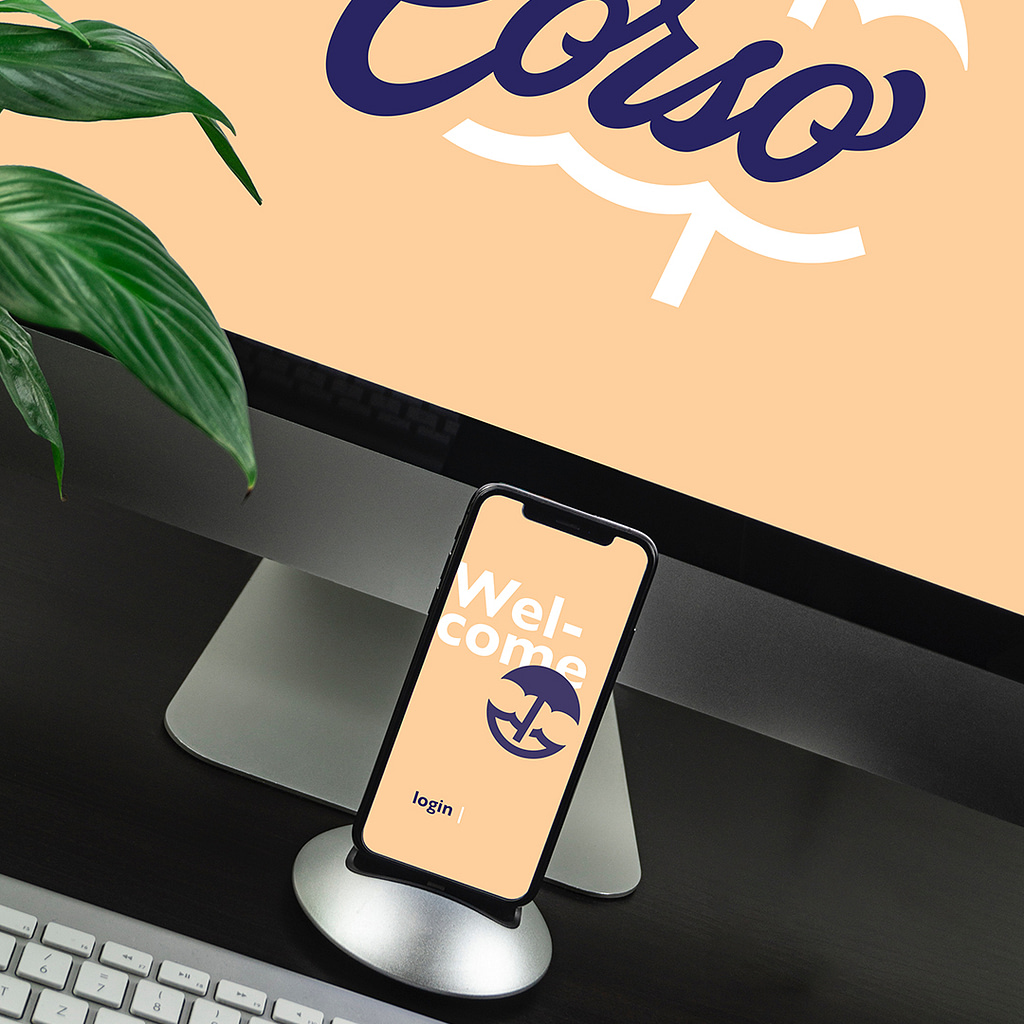
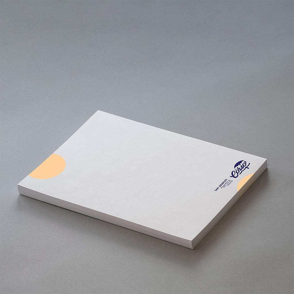
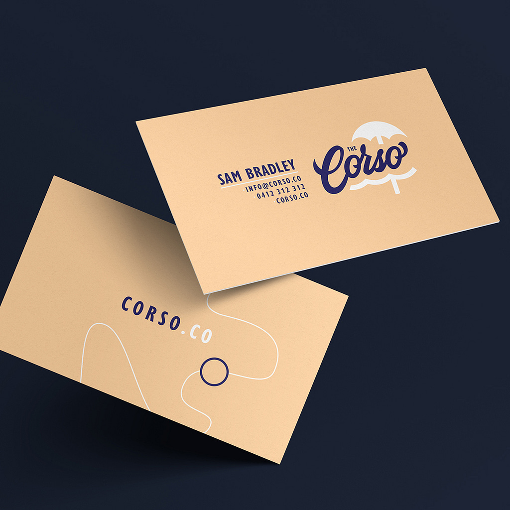
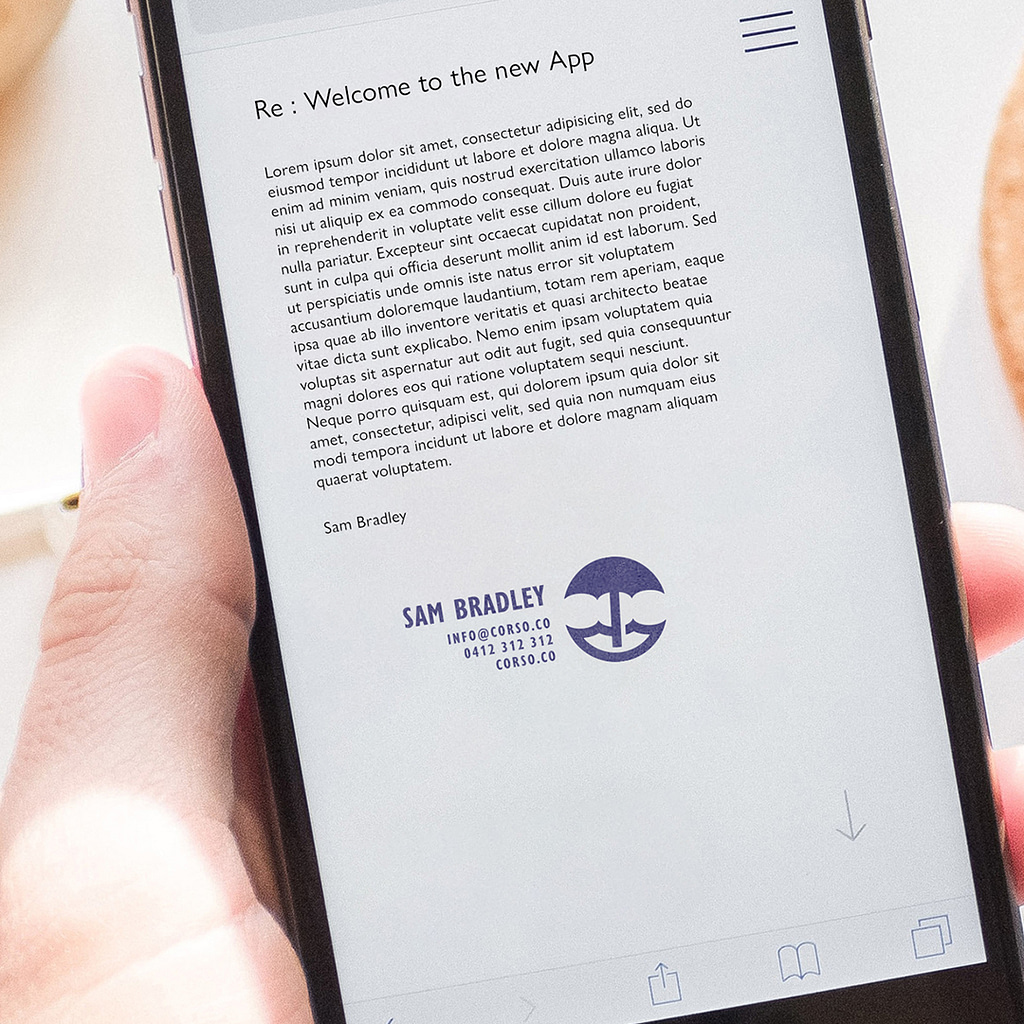
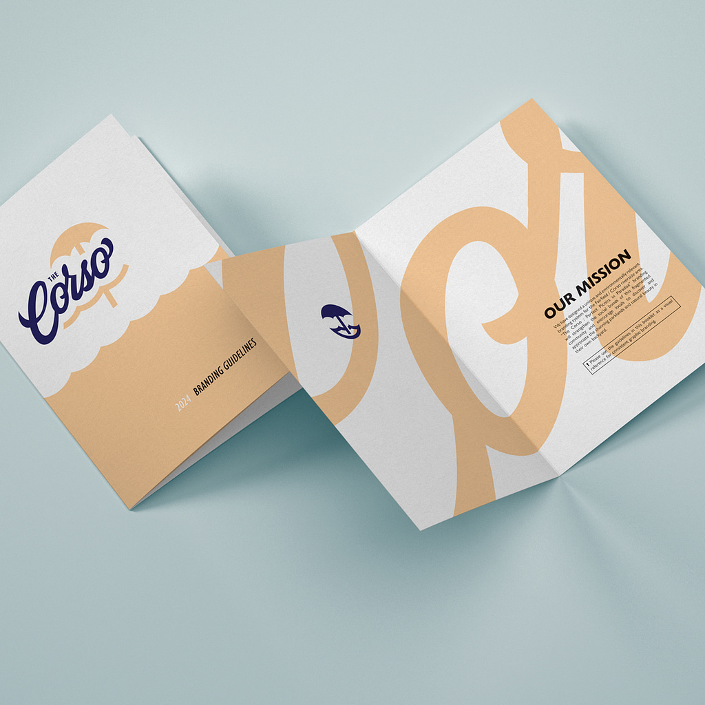
I was required to create a full branding package including logo, variations, business cards, email signatures, app, letterhead and styleguide document.
I began my research to confirm there was no existing or historic branding in place. After visiting the area I was captivated by the sight of picnics next to shimmering water in the setting sun. This inspired me to create an initial moodboard of ideas.
I was also interested in the shape of the iconic green bridge crossing to UQ and the shape of the river itself from above. The Jacaranda trees lining the parks and setting sun provided further inspiration for the colour scheme.
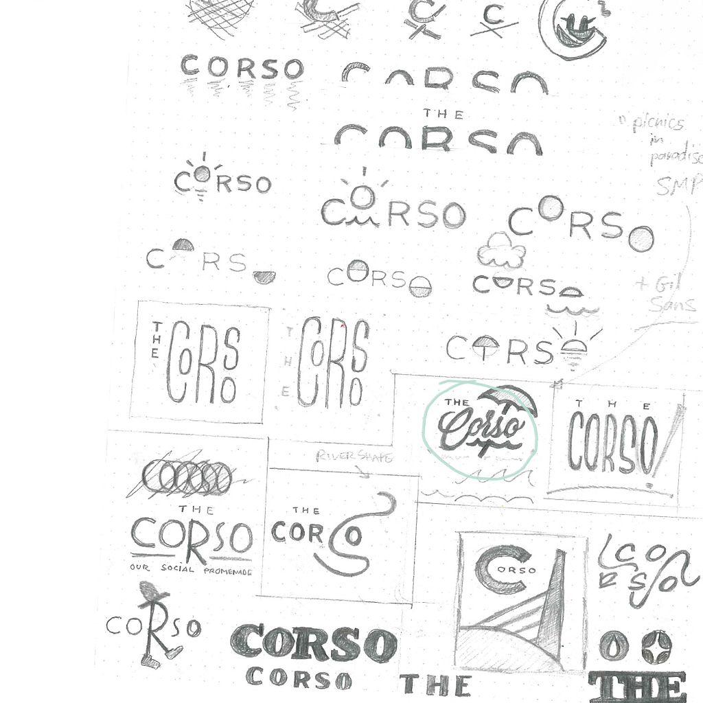
I sketched a page full of concepts related to my impression of the area. The preferred sketch was a classic script style with a simple picnic umbrella by the water motif. It had a nostalgic, laid-back quality that captured the warm, natural appeal I had felt in person.
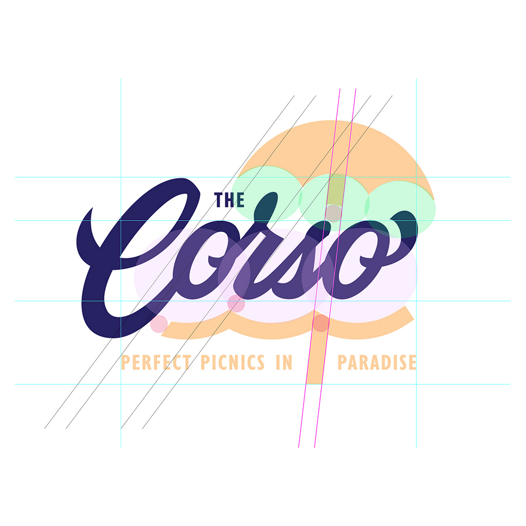
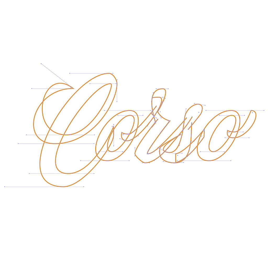
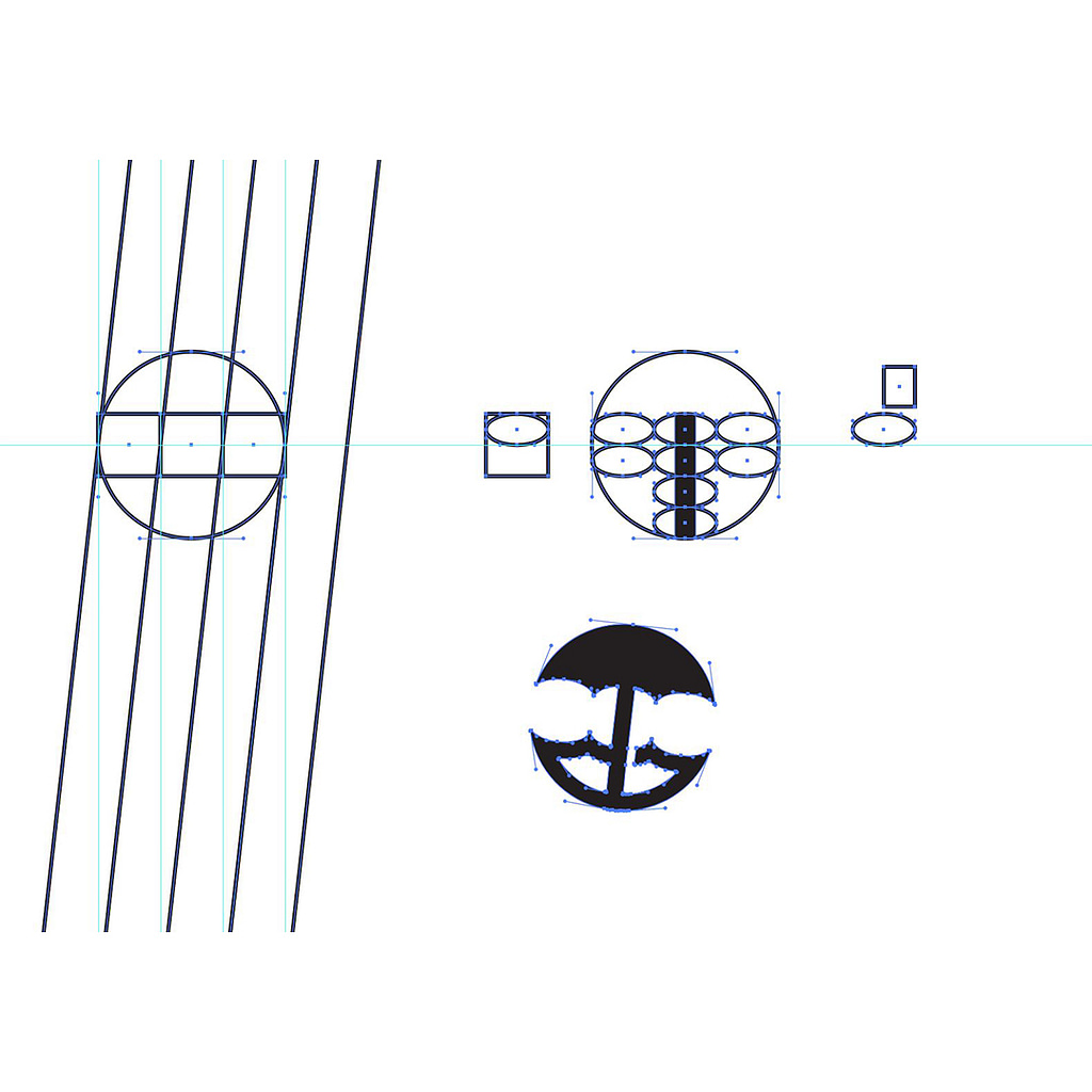
The script logotype was vectorised using a method that minimises points and creates smooth, uniform curves. All branded documents are editable print-ready files for team use.
