
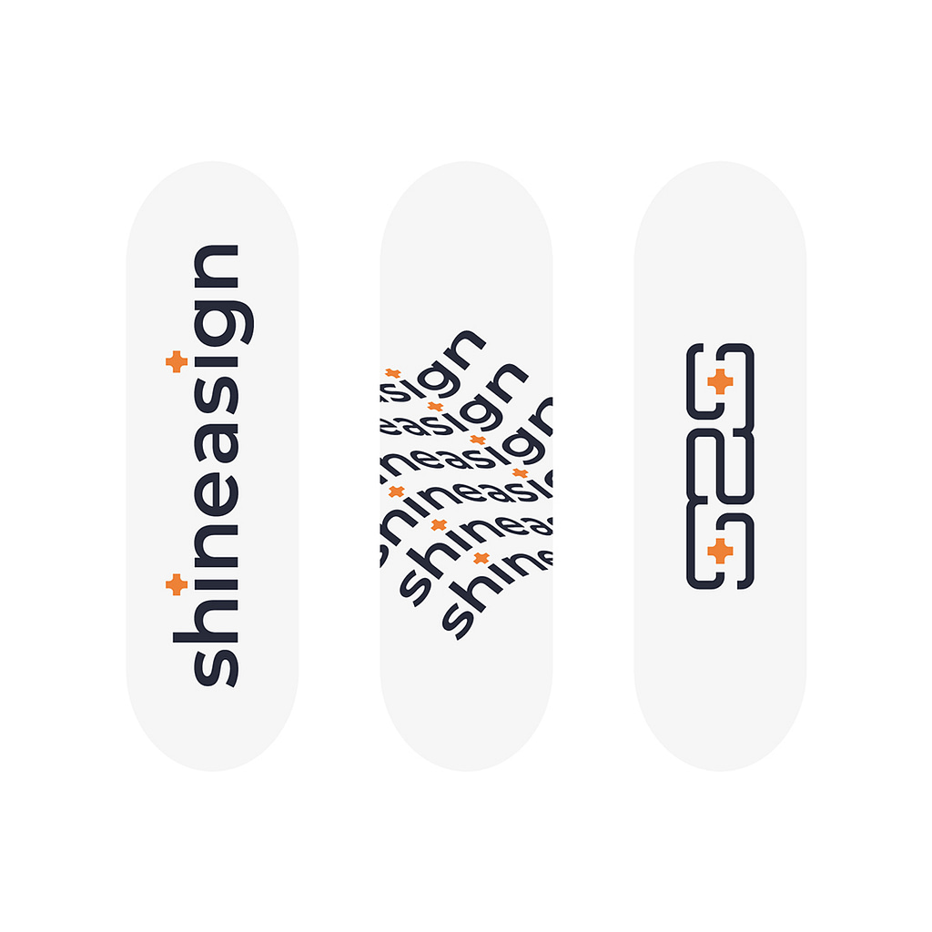
These promotional skateboards were created for my personal brand. I wanted to make prints that would reflect the spirit of the brand in an interesting and abstract way. They also needed to be appealing and functional for skaters.
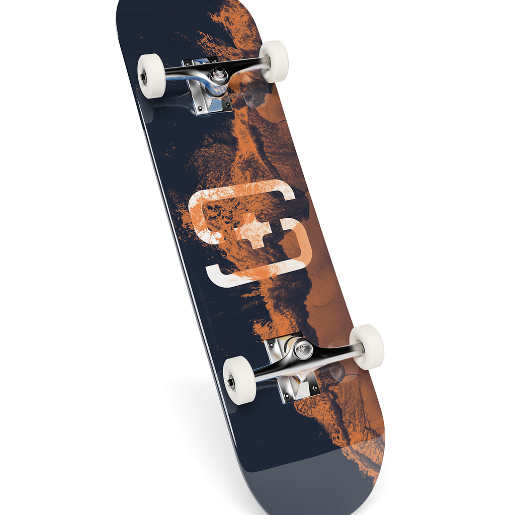
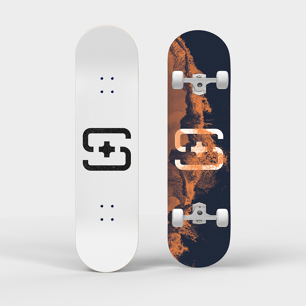
The designs attempt to capture the raw organic beauty of nature contrasted against the clinical order of geometric design. The delicate creative balance between chaos and order is reflected using brand colours, logos and edited photographs.
The existing brand logo is symmetrical and I wanted to take advantage of this when creating the deck design. The wave graphic has been edited to also be symmetrical. This means the deck has visual balance and appeal no matter the angle, direction or trick being performed. The design also pays homage to classic surf culture from which skateboarding emerged.
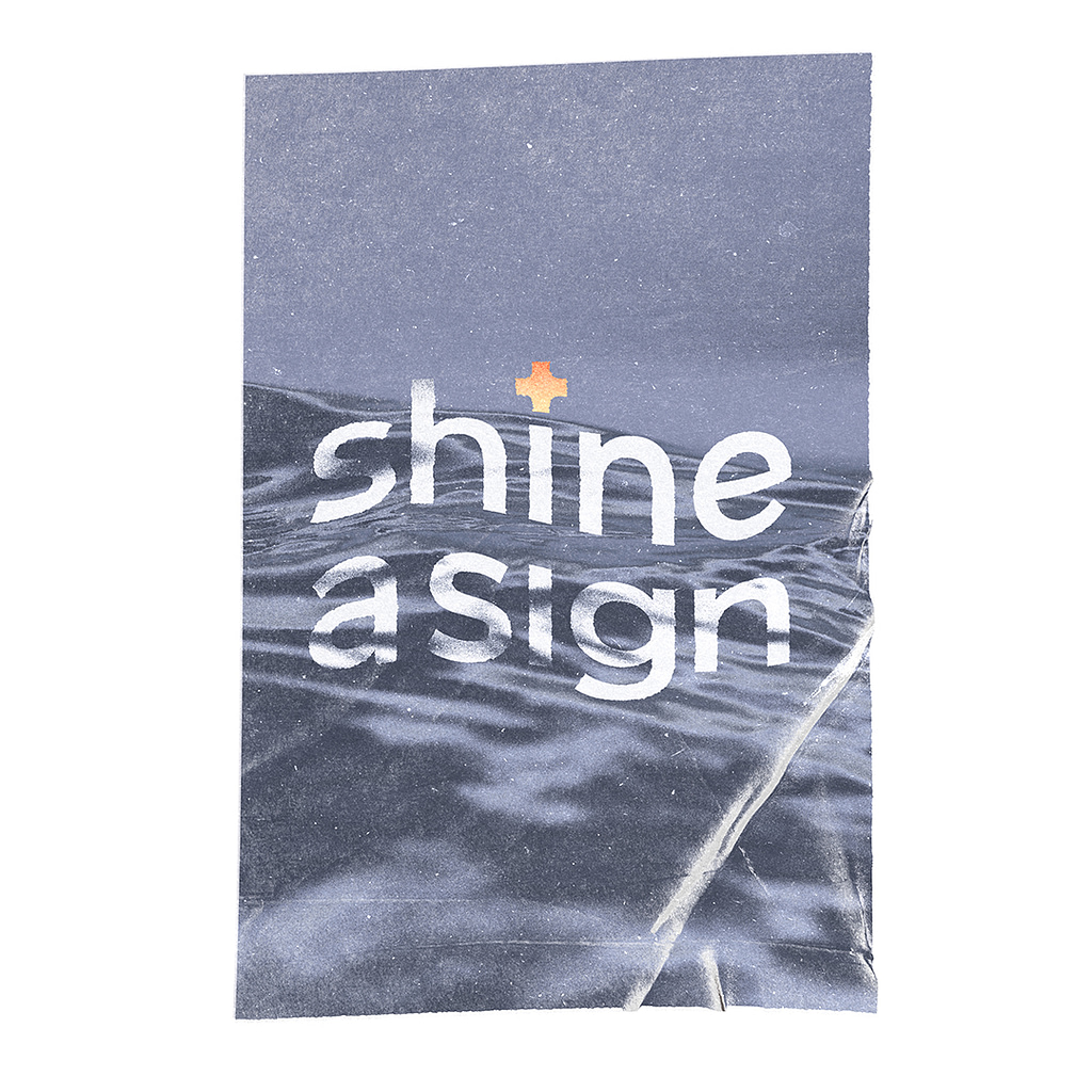
This wave series also includes a branded poster print design about staying focused when things fall apart and finding the unique beauty in entropy.
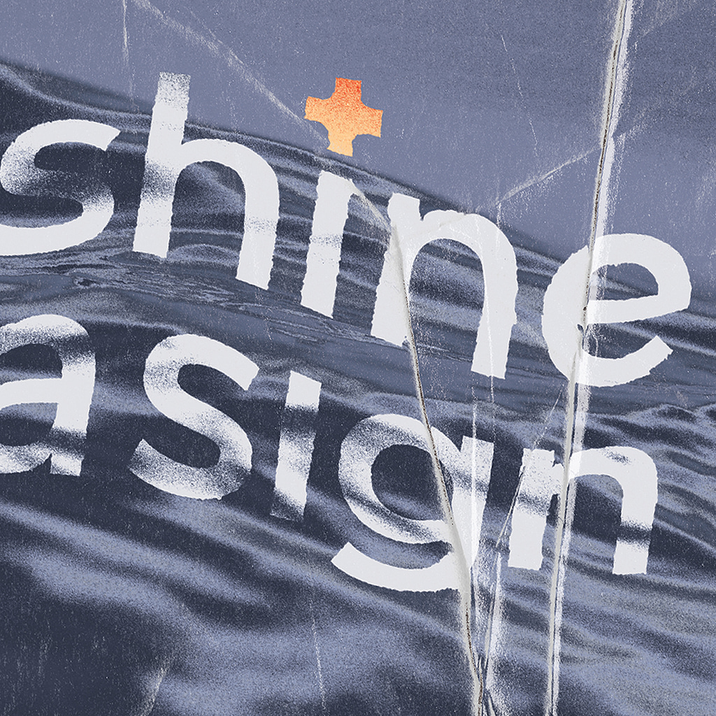
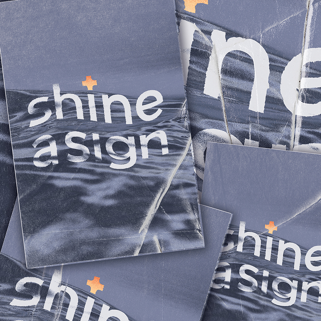
Each print is squashed and weathered by hand to create an individual wave effect.
A1 size matte print 350gsm.